They say the first bite is with the eye, so where best to start than a menu that’s going to get you hungry! Here are some examples of different menu styles and how effective they are for restaurant marketing and branding….

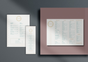
VyTa is a luxurious, Italian restaurant located in the heart of Covent Garden. They exude style and sophistication and their menus reflect this through the simplicity of the design. The geometric motif that can be seen on the menus echo the marbled interiors of the restaurants, and the main colours of gold and green are also widely used inside the restaurant. Using these colours sparingly keep to VyTA’s branding and also keep to a clean, fresh menu design which reflects their overall style.

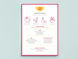
Icons and infographics are a fun way of making a menu more engaging. The design features emphasise key menu items as they are the stand out elements on the page and are sometimes referred to as ‘eye magnets’ because they are exactly that – things that attract the eye. This NumNum menu, for example, demonstrates a build your own bowl concept, which is easily followed by blocks being sectioned out and icons to show key elements of the bowls.

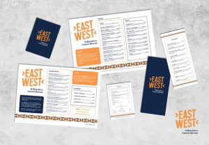
The most important thing for a menu to be is easy to read. Having sections blocked out by colour or shapes can really help this and make it easier for the eye to flow around the page. These East West menus do exactly that, by blocking out different elements of the menus such as starters, salads and pizzas the customer can easily see the dishes they want to pick out. This has been done using brand elements such as dotted lines, fonts and especially use of colour. Also when having more than one menu, such as separate food, drinks and desserts, using these structures and brand elements across all menus create for overall cohesive restaurant marketing.
Contact us
To find out how our approach can help you - send us the form below with some basic information and we'll be in touch to discuss the finer details.


