Brand Identity & Restaurant Marketing
Sep 26th 2019Restaurant marketing goes hand in hand with graphic design. At Me:Mo our creative team work closely with our marketing specialists ensuring that we produce compelling content to portray a brand to the outside world.
An eye-catching logo or piece of design is the first impression of a brand, before copy, content and offering is read. Strong branding and brand identity go a long way and it’s important that design is consistent and recognisable across the board.
Storytime Menu card
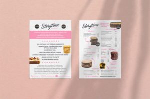
Storytime is an award-winning bakery based in West London, dedicated to providing customers with the finest quality artisan product. A recent design task our creative team have been working on is A5 menu cards for Storytime bakery. Their branding is very eye catching and modern; with pink, white and grey tones, complementing their imagery of fresh, mouth-watering products. Both their logo and header font are handwritten, reflecting the homemade element of their baking. The menu card we’ve designed is informative, packed with information and copy yet broken up by cut out images and is laid out in a way that draws the eye around the page.
Street Greek venue hire flyer
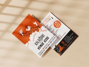
Street Greek is a modern healthy Mediterranean street food restaurant.
Their aim is to pay homage to ancient Greek values in servicing customers with modern street Greek food. Using time honoured cooking methods, family recipes and quality produce.
Food was an essential part of the Ancient Greeks’ culture. It was always connected to the Gods. The Gods were so important that the Greeks used to sacrifice some of their livestock just to be loved by them and to have good fortune. The love Greeks had for their Gods was so prominent that they even used to offer food and drinks that only the Gods could consume. So, we decided to give it a twist. Food in “Kalamaki Street Greek” is remarkably good because Gods are the ones who stay busy preparing it for the people. To reflect their story their branding incorporates illustrations of Greek gods throughout, each with their own story matching their food.
The venue hire flyer, uses their branding and their Greek god illustrations to make an informative piece of work more exciting.
Lucknow 29 Newsletter design
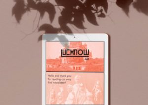
Lucknow 49 is an Indian restaurant in Mayfair, London, that celebrates the warmth, colours, patterns and rich tones of the country. Serving slow cooked Awadhi cuisine that will make you feel like you’re having the best home cooked meal. The branding was inspired by letters from Indian patterned postage stamps, elaborate foreign fonts and interior contents. Bright and bold colours are used throughout to resemble roadside cafes across India along with the vibrancy of the food they serve. This is reflected in the recent newsletter design we have created for them.